

Nursery Rhyme Prints: Style, Material & Placement Guide
Have you ever asked whether a nursery print needs to look babyish at all? A bare wall can tempt you towards the cheapest cute picture available, but a nursery is a living room in miniature. It must cope with bright daylight, changing humidity, curious hands, limited space and a child whose tastes will develop quickly.
Nursery rhyme prints offer a more considered answer. They bring familiar rhythm, illustration and storytelling into the room, while a carefully chosen design can remain relevant beyond the cot years. The key is to treat the print as part of the room's structure, not as an afterthought. Material, scale, framing and colour matter just as much as the rhyme itself.
Why Nursery Rhyme Prints Matter More Than You Think
Stand in an empty nursery and the wall can feel strangely demanding. The cot is assembled, the changing table is in place, yet the room lacks the small visual details that make it feel personal. A nursery rhyme print can fill that gap without requiring a complete themed makeover.
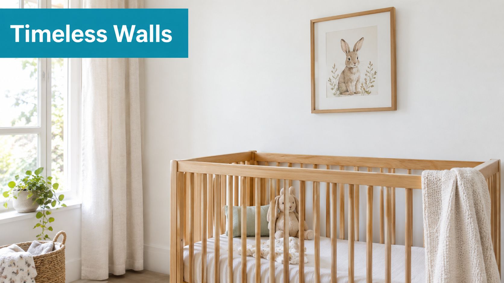
A gentle illustration of a rabbit, bear or woodland scene can sit comfortably beside natural wood, woven storage and plain bedding. If the artwork includes a familiar rhyme, it also becomes part of a daily ritual. You might point to an image while changing your baby, then read or sing the words later as your child begins to join in.
That combination gives nursery rhyme prints unusual staying power. They're decorative, but they're also prompts for conversation, memory and language. Unlike a character-led decoration chosen only for infancy, a restrained print can move from the nursery to a toddler's bedroom or reading corner.
A tradition with a practical purpose
The printed nursery rhyme has a deep British history, but its relevance isn't only nostalgic. Printed words give an oral tradition a visible form, allowing families to revisit the same verse across generations. The artwork can also help a child connect sounds with pictures, especially when the layout is clear and the type is large enough to read together.
Design principle: Choose a print that supports a moment you'll actually repeat, such as bedtime reading, singing or naming animals.
For a first nursery, that makes the purchase more meaningful than a temporary decorative fix. Select a rhyme and image you enjoy seeing every day, then let the surrounding room stay calm and adaptable.
A Brief History of Nursery Rhyme Prints in Britain
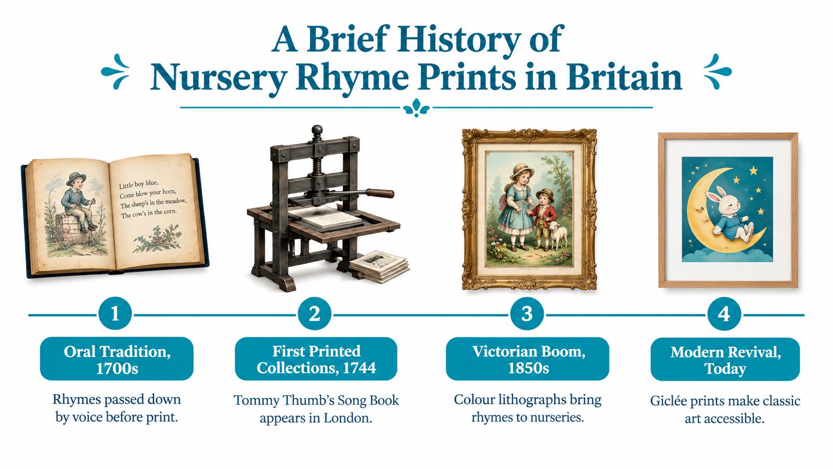
Nursery rhymes began as spoken and sung traditions, but printing gave them a durable public form. The UK print history can be traced to 1744, when Mary Cooper published Tommy Thumb's Pretty Song-Book in London. It's widely described as the earliest surviving anthology of English nursery rhymes, and only two known copies survive, held by the British Library and Princeton's Cotsen Children's Library. The history of nursery rhyme printing shows why early examples are both culturally important and exceptionally rare.
The transition from voice to paper changed how families encountered these verses. Collections could be bought, kept and passed on, while illustrations gradually made the material more attractive as children's décor. By the 1820s, the terms nursery rhyme and children's song had become established in literature, helping define the genre in the form we recognise today.
From limited editions to decorative interiors
James Orchard Halliwell's The Nursery Rhymes of England provides another important example. Its first edition was printed at the close of 1841 for limited Percy Society circulation, followed by a second edition in 1843. The rapid need for another edition indicates strong interest in printed nursery rhyme collections during the Victorian period. This account of British nursery rhyme print culture also records how rhyme imagery moved beyond books.
In 1875, Walter Crane was commissioned to design nursery wallpaper based on children's book imagery. One design, The Queen of Hearts, was issued that year, although machine-printed nursery paper cost 2 shillings 6 pence per roll, placing it beyond the reach of many working-class households. The history is a useful reminder that nursery art has always been shaped by both creative ambition and material access.
Modern reproductions continue that story. Choosing archival paper, a stable panel or a well-made frame isn't just a luxury decision. It determines how successfully a historic visual language works in a busy contemporary home.
Choosing the Right Print Material for Your Nursery
Material affects how a print behaves after it leaves the shop. A nursery near a steamy bathroom, a frequently opened window or drying laundry needs a different solution from a well-ventilated room with stable conditions.
Match the surface to the room
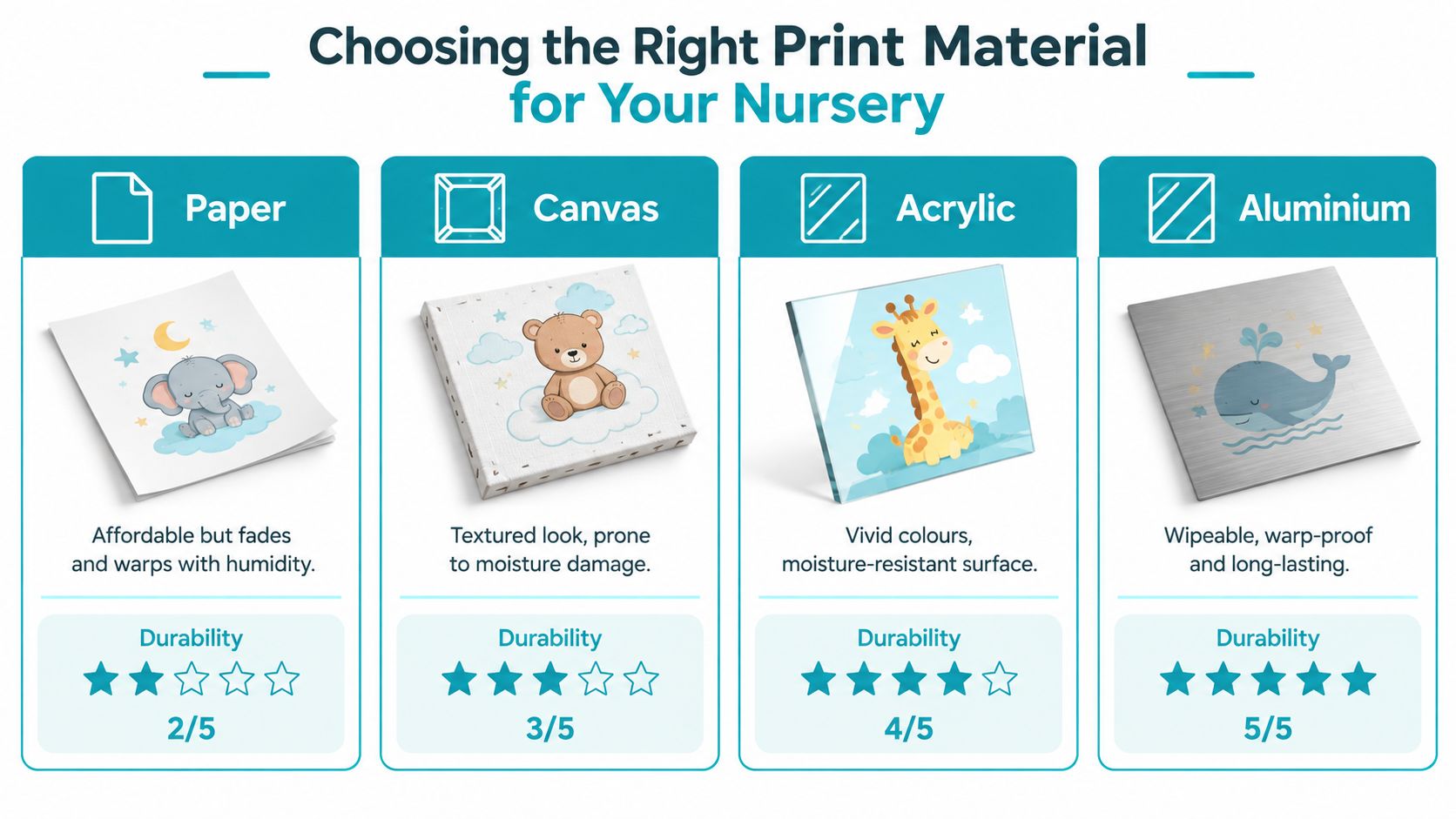
Paper offers a traditional, soft appearance and suits a controlled indoor environment. It's a sensible choice when the print will be framed behind glass and kept away from condensation, but paper-based artwork needs protection from moisture and poor storage conditions. One UK wall-art guide recommends storing paper art below 10°C and at 30–50% relative humidity for long-term preservation. This UK wall-art guidance is particularly relevant in a room where ventilation and cleaning routines vary.
Canvas adds texture and can make a simple rhyme illustration feel more painterly. Its open, fabric-based surface is less convenient to wipe clean, so it works best where the artwork won't be exposed to splashes or repeated handling. Think of it as a visual choice for a calm wall, not a surface for a changing area.
Acrylic gives colours a vivid, contemporary finish and handles humidity better than absorbent materials. Its sealed surface is easier to wipe, although reflections can become distracting if the print faces a bright window.
Aluminium is particularly useful in a light-filled or moisture-prone room. Suppliers describe it as a non-porous, sealed surface that resists dimensional change and preserves fine detail without the reflection associated with some glossy finishes. That can improve legibility when you're reading text-heavy artwork from across the room.
For wider nursery planning, The Fabric Company nursery guide is useful because curtains, upholstery and soft furnishings also influence humidity, cleaning and the overall tactile character of the room.
Practical rule: Pick paper or canvas for a stable, framed display. Choose acrylic or aluminium when wipeability and humidity resistance matter more than a traditional texture.
Sizing, Placement and Framing Strategies for Small Spaces
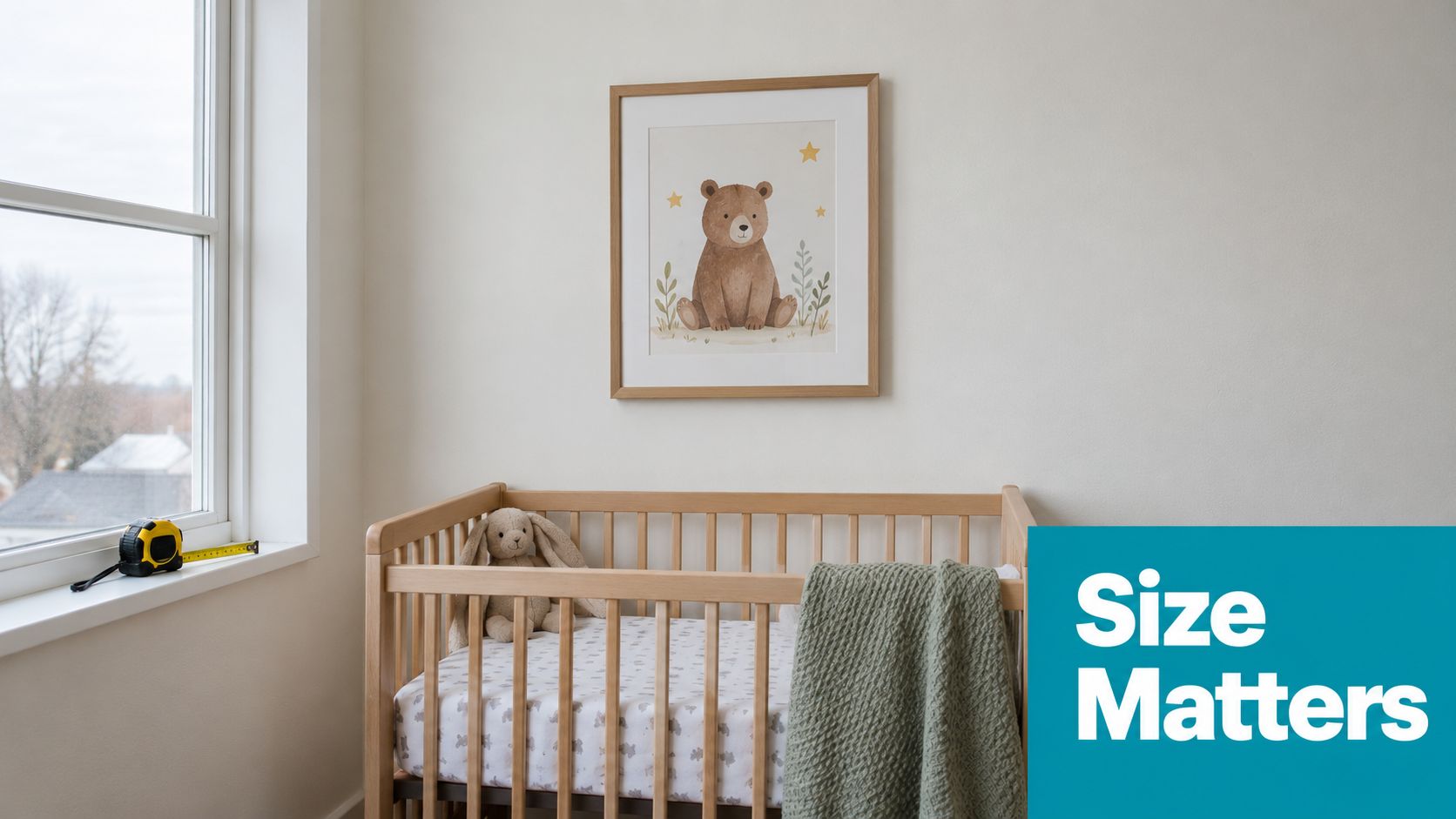
Small rooms need fewer, better-positioned objects. Before ordering, measure the wall width, the furniture below it and the clearance around doors, windows and shelves. Mark the proposed artwork with removable tape so you can judge its visual weight from the doorway and from the cot.
A single print can anchor a narrow wall, while a framed set creates a stronger focal point above a cot or dresser. UK nursery design advice increasingly favours framed groups of three or five prints, centred above the main furniture, rather than matching every surface with a character or pattern. This guidance on gender-neutral nursery styling recommends looser narratives, which are easier to adapt when furniture changes.
Build a composition, not a cluster
Keep the arrangement visually connected through one shared feature, such as matching frames, a repeated background colour or a common illustration style. The rhymes don't need to tell one continuous story. A moon image, a woodland animal and a botanical border can feel coherent when their scale and palette are related.
For renters, lightweight frames and removable hanging systems reduce commitment, but always check the manufacturer's weight and surface guidance before applying anything. Avoid placing artwork where a child can pull it down, and keep fixings secure rather than relying on appearance alone.
Framing also changes perceived size. A broad mount gives a small print breathing room, while a slim frame suits a tight wall beside a wardrobe. If you're comparing standard formats, this guide to 10 x 8 frames can help you understand how a common print size behaves within a framed layout.
Matching Nursery Rhyme Prints to Current UK Design Trends
The strongest current direction in UK nursery design is quieter and more flexible than the novelty rooms many parents remember. Recent 2026 trend coverage describes jungle and woodland scenes, gentle animals and botanical patterns as popular choices for baby rooms. The trend overview from Wallsauce points towards nature-led storytelling rather than loud, isolated characters.
That shift works beautifully with nursery rhyme prints. Instead of choosing the most recognisable cartoon version of a rhyme, look for an illustration that leaves room for interpretation. A rabbit can suggest a story without tying the room to a single licensed character. A moon, star, garden or bird can feel appropriate in infancy and still make sense when your child begins choosing books independently.
Use colour to soften the theme
Earthy, gender-neutral shades such as sage, mushroom, terracotta and muted olive create a calm backdrop for rhyme imagery. They also pair naturally with oak, beech, rattan, cream textiles and painted furniture. You don't need every print to use the same colour, but a shared undertone will stop a small room from feeling visually busy.
Cartoon-heavy and text-heavy artwork can date quickly because it announces a very specific age. That doesn't make it wrong, especially if a particular rhyme has family meaning, but it does make replacement more likely. Nature-led prints give you a longer design horizon and allow the room to evolve through bedding, toys and books rather than a full redecoration.
Ask yourself a simple question before buying: Would I still like this image if the rhyme text were removed? If the answer is yes, you're probably choosing a strong piece of art rather than a temporary theme accessory.
Personalisation Options and Custom Design Possibilities
A personalised nursery rhyme print can be more useful than a full wallpaper treatment because it adds meaning without fixing the entire room to one theme. A child's name, a meaningful date or a selected verse can turn a familiar illustration into something specific to your family. When the design stays restrained, the personal detail feels considered rather than decorative noise.
Custom colour choices are especially helpful in a small UK home. You might adapt the background to match an existing sage wall, select terracotta accents to connect with a rug, or request softer contrast for a room with strong natural light. The artwork can then support furniture you already own instead of forcing you to replace it.
Plan the brief before ordering
Give the retailer clear information:
- Name and wording: Check spelling, punctuation and the exact line you want included.
- Colour direction: Mention paint, bedding or furniture colours already in the room.
- Format: Confirm whether you need a print only, a framed piece or a surface suitable for a humid space.
- Future use: Decide whether the design should suit a baby room only or remain appropriate in a toddler bedroom.
Personalisation is also a practical alternative to a room reset. One carefully designed print can refresh a wall after the cot moves, while removable or replaceable artwork lets you change the story without covering every surface. This guide to personalised nursery wall art can help you compare the kinds of custom options available.
Choose personal details that will remain meaningful. A name is usually more enduring than a fleeting character preference, and a simple rhyme reference can preserve the story while leaving the visual style open to change.
How to Care for Your Nursery Rhyme Prints
Care starts with placement. Keep paper and canvas away from condensation, radiators, damp corners and direct sunlight that falls across the artwork for long periods. Bright windows are especially important because glare can reduce readability, while prolonged light exposure can alter colours over time.
Use the cleaning method that matches the surface:
- Paper behind glass: Dust the frame with a soft, dry cloth. Clean the glass separately and avoid spraying liquid near its edges.
- Canvas: Remove dust gently with a clean, dry, soft brush. Don't rub the printed surface or introduce water.
- Acrylic: Wipe with a soft microfibre cloth and a suitable non-abrasive cleaner. Avoid rough paper towels that can mark the panel.
- Aluminium: Use a damp, soft cloth for ordinary marks, then dry the surface. Don't use harsh chemicals or abrasive pads.
Protect the frame as well
Check that fixings remain secure after moving furniture or carrying out maintenance. A frame that leans against a wall may look stable but can become vulnerable when a child begins exploring the room. Keep hanging hardware out of reach and follow the product's installation instructions.
For long-term preservation, paper-based prints benefit from controlled conditions rather than frequent cleaning. The earlier UK wall-art preservation guidance notes the importance of stable humidity and cool storage for paper art, so plan temporary storage carefully if you rotate seasonal artwork.
Avoid leaning prints against damp walls, storing them in loft spaces with unstable temperatures or wiping any surface with excess water. A light, regular dusting is safer than an occasional aggressive clean.
Where to Find Quality Nursery Rhyme Prints in the UK
A reliable retailer should make the important specifications easy to find. Look for the print substrate, paper weight where relevant, ink or finish information, framing choices, dimensions, delivery details and a clear returns policy. If the artwork includes a rhyme, check the wording carefully before ordering, particularly where a traditional verse has several versions.
Design variety matters, but it shouldn't replace quality. A useful collection might include classic rhyme imagery, woodland animals, botanical scenes, personalised artwork and formats that work in narrow spaces. You can also explore buying art from independent artists if you want a less uniform look and a stronger connection with the maker.
Make the final choice by room conditions
Start with the wall rather than the product page. Decide whether the space needs a single statement print or a coordinated group, then choose a material that suits humidity, daylight and cleaning. A paper print behind glass may be ideal for a quiet reading corner, while aluminium or acrylic can make more sense near a busy changing area.
If you want a UK-focused starting point, this nursery wall-art guide brings together ideas for prints and children's bedroom décor. Quote My Wall offers nursery and children's bedroom prints, alongside other wall décor formats, so you can compare a permanent framed look with a more flexible update.
The best nursery rhyme prints aren't necessarily the loudest or most expensive. They're the ones whose imagery you'll enjoy, whose material suits the room and whose scale leaves space for your child's life to unfold around them.
Quote My Wall offers nursery prints and children's bedroom wall décor, including designs that can support a personalised or adaptable room scheme. Visit Quote My Wall to explore the collection, compare formats and choose artwork that fits your nursery's space, style and everyday demands.