
Baby Shower Invitation for Boy: A Complete Guide 2026
You've probably got ten browser tabs open right now. One has teddy bears and bright blue bunting. Another feels too formal. A third is lovely, but it looks nothing like the calm, modern nursery style you like. That's a common problem with a baby shower invitation for boy themes. The internet still pushes a very narrow look, even though many UK parents want something softer, less stereotyped, and easier to coordinate with the rest of the celebration.
The invitation sets the mood before anyone arrives. It tells guests whether they're coming to a relaxed brunch, a woodland-themed afternoon tea, or a simple gathering with cake and good conversation. It also has a practical job to do. Guests need to know where to be, when to reply, and what kind of event they're attending.
The best invitations do both jobs well. They feel personal, and they make life easier for everyone.
Choosing Your Theme and Colour Palette
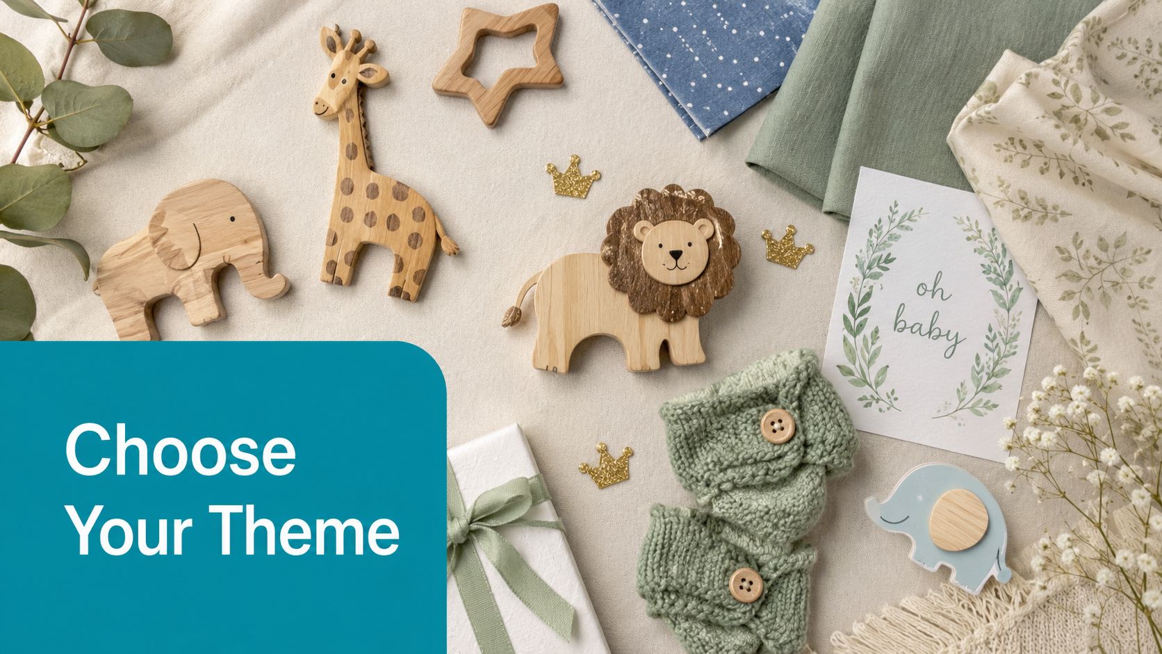
The old default for a baby shower invitation for boy is easy to spot. Bright blue background, cartoon pram, oversized “It's a Boy!” headline. It still works for some families, but it's no longer the only good option. In fact, Boxwood Rose notes that 68% of UK parents now prefer gender-neutral or muted palettes over primary blue, yet 92% of invitation guides still default to bright blue themes and stereotypical phrasing. That gap is exactly why so many invitations feel dated.
Start with the room, not the cliché
If the nursery mood is soft, natural, and calm, the invitation should echo that. Pull colours from bedding, paint swatches, wallpaper samples, or even a favourite baby blanket. If you're still gathering ideas, these nursery wall decor ideas are useful for spotting palettes that feel current without becoming trend-chasing.
A good palette usually has three layers:
- Main colour like dusty blue, sage, oat, stone, or warm ivory.
- Supporting colour such as muted mauve, clay, eucalyptus, or soft grey.
- Accent in a darker tone like deep teal, slate, forest green, or brushed gold.
Practical rule: if every colour on the invite shouts, none of them stand out.
Four themes that feel current
Woodland adventure
This works beautifully for parents who want something sweet but not sugary. Use sage, moss, bark brown, and soft blue-grey. Motifs can include foxes, bears, rabbits, pine branches, wooden toys, and little mountain sketches.
This theme suits a garden room, village hall, or cosy at-home shower. It also transitions well into nursery decor later because woodland prints rarely feel tied to one party.
Little prince on the moon
For a gentler take on “boy” styling, celestial themes are hard to beat. Skip the bright navy overload and use smoky blue, cream, muted gold, and soft taupe. Add stars, crescent moons, clouds, and delicate line drawings rather than busy glitter effects.
This theme works especially well for evening showers, winter due dates, or parents who want something dreamy rather than playful.
Modern minimalist
Some families don't want a themed illustration at all. They want clean type, lots of white space, and one quiet motif. Think pale stone, warm white, dusty blue, and a single hand-drawn bow, moon, or tiny heart.
The appeal is simplicity. A minimalist invitation often feels more expensive than it is because the design isn't trying too hard.
Storybook soft boy
Muted “boy” styling really shines. Blend dusty blue with sage, mauve, parchment, or biscuit tones. Use hand-painted animals, sketch florals, tiny stars, or gingham. It feels gentle, modern, and much closer to the kind of nursery many parents create.
What usually works and what usually doesn't
A cohesive theme looks better than a “boy” label added at the last minute. That means matching the style of the illustration, the wording, and the colours.
What tends to work:
- Muted palettes that feel calm in print and on screen.
- One lead motif rather than five unrelated graphics.
- Themes with life beyond the shower, so the design can inspire nursery art, thank-you cards, or keepsakes.
What often falls flat:
- Overusing royal blue on every element.
- Mixing rustic animals with glitter lettering and formal wording.
- Choosing a theme because it sounds boyish, rather than because it feels like you.
Perfecting Your Invitation Wording and Etiquette
Pretty design gets attention. Clear wording gets replies.
Many invitations fail on the practical details, not the aesthetic ones. Minted reports that omitting registry information and RSVP deadlines reduces response rates by 42%, and that 65% of UK hosts fail to include registry links or gift preferences, leading to 31% lower gift fulfilment rates. That lines up with what planners see in real life. Guests are usually willing to come and generous with gifts, but they need straightforward information.
What every invitation needs
Before you choose the exact wording, make sure these basics are present:
- Who the shower is for. Use the parent or parents' names clearly.
- Date and start time. Include the day as well, not just the date.
- Venue details. Full address for in-person events, joining details for virtual or hybrid gatherings.
- RSVP deadline. Keep it visible, not buried in tiny print.
- Contact method. Mobile number, email, or event platform.
- Event style. Brunch, afternoon tea, couples' shower, baby sprinkle, open house.
- Gift guidance. Registry link, favourite shops, or a gentle note such as “books instead of cards”.
If guests are likely to ask what to buy, it's helpful to include a short line that points them in the right direction. Some hosts also share a shortlist of useful ideas. If you need inspiration for finding age-appropriate baby gifts, that guide gives practical examples without making the invitation feel pushy.
Leave guests guessing and they'll message you individually. Spell it out once and everyone relaxes.
Three wording styles you can adapt
Playful
Oh boy, our little one is on the way.
Please join us for a baby shower in honour of Emma Taylor
Saturday 14 June at 2pm
The Garden Room, Henley House, Bristol
Kindly RSVP by 31 May to Sophie on 07xxx xxxxxx
Baby registry and gift preferences can be found via the link below
This style suits relaxed parties, family gatherings, and showers with games or themed food.
Traditional
Please join us for a baby shower celebrating the upcoming arrival of baby boy Taylor.
In honour of Emma Taylor
Sunday 22 September at 1pm
The Orangery, Bath
RSVP by 8 September to sophie@email.com
Registry details enclosed
Traditional wording works well for a more formal lunch, tea room venue, or a printed invitation with classic typography.
Modern
A little boy is joining the family.
Come celebrate with us
Saturday 9 August, 11am to 1pm
Brunch at The Ivy Room, Leeds
Reply by 26 July
Registry and details via QR code
Shorter wording looks best on minimalist invitations. It's clean, stylish, and easy to scan.
Timing and etiquette details that matter
US guidance often suggests sending invitations 4 to 6 weeks before the event, which Pampers mentions here. That's a useful planning guideline, but it isn't UK-specific tracking data, so treat it as a practical rule of thumb rather than a measured national standard.
For UK hosts, the sensible approach is simple:
- Send earlier if guests need to travel or arrange childcare.
- Add gift wording gently rather than making it the visual focus.
- Name the format clearly if it's hybrid, couples-only, or a sprinkle.
- Keep the RSVP line warm and direct, not formal to the point of stiffness.
The best wording sounds like a real person inviting loved ones, not a template trying too hard.
Mastering Layout and Typography
A beautiful baby shower invitation for boy themes usually comes down to one thing. Hierarchy. Guests should know what to read first, second, and third without effort. If everything is decorated equally, the eye bounces around and the important details get missed.
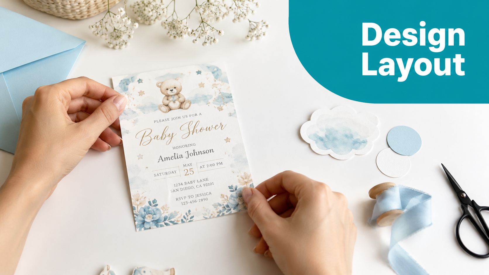
A useful benchmark appears in this UK-based digital invitation workflow example on YouTube, which states that the highest success rate for attendee engagement was 78% when the invitation included a gender-coded colour palette, a script font with at least 12pt stroke weight for the baby's name, and a visual illustration positioned within the left 30% of the layout. Even if you aren't building from that exact formula, the design logic is solid.
Make one thing the star
On most invitations, the star is one of these:
- the baby-focused headline
- the parent's name
- the central illustration
Choose one. If you give the same visual weight to the bear, the headline, the date, the venue, and the RSVP line, the design becomes noisy.
A reliable layout order is:
- Headline or baby name
- Celebration line
- Date and time
- Venue
- RSVP and gift details
That sequence mirrors how guests process the information.
Pair fonts with restraint
Script fonts can be lovely, but they need support from something cleaner. A common pairing is:
- Script font for the baby's name or headline
- Sans-serif font for details like date, address, and RSVP
Many DIY invitations often fall short in this regard. Hosts use a decorative script for everything, which looks charming at first glance and exhausting on second reading. If the venue address or email is hard to read, the design has failed at its basic job.
A good invitation doesn't just look pretty on your laptop. It stays readable on a cracked phone screen in a bright kitchen.
Use space as part of the design
White space isn't empty. It gives the wording room to breathe and makes the invitation feel calmer and more polished.
Try these fixes if the design feels crowded:
- Trim the wording rather than shrinking the font.
- Remove one decorative element before changing the layout.
- Group related details together, so the eye reads them as a block.
- Keep margins generous around the outer edge.
Illustrations matter too. If you use an animal, moon, or balloon graphic, place it deliberately. Off to one side with text balanced beside it often looks more refined than centring everything.
Deciding How to Create Your Invitations
Once the design direction is clear, the next question is practical. Are you making them yourself, editing a template, or handing the whole thing to a professional? The right answer depends less on taste and more on time, confidence, and how much back-and-forth you can tolerate before the event.
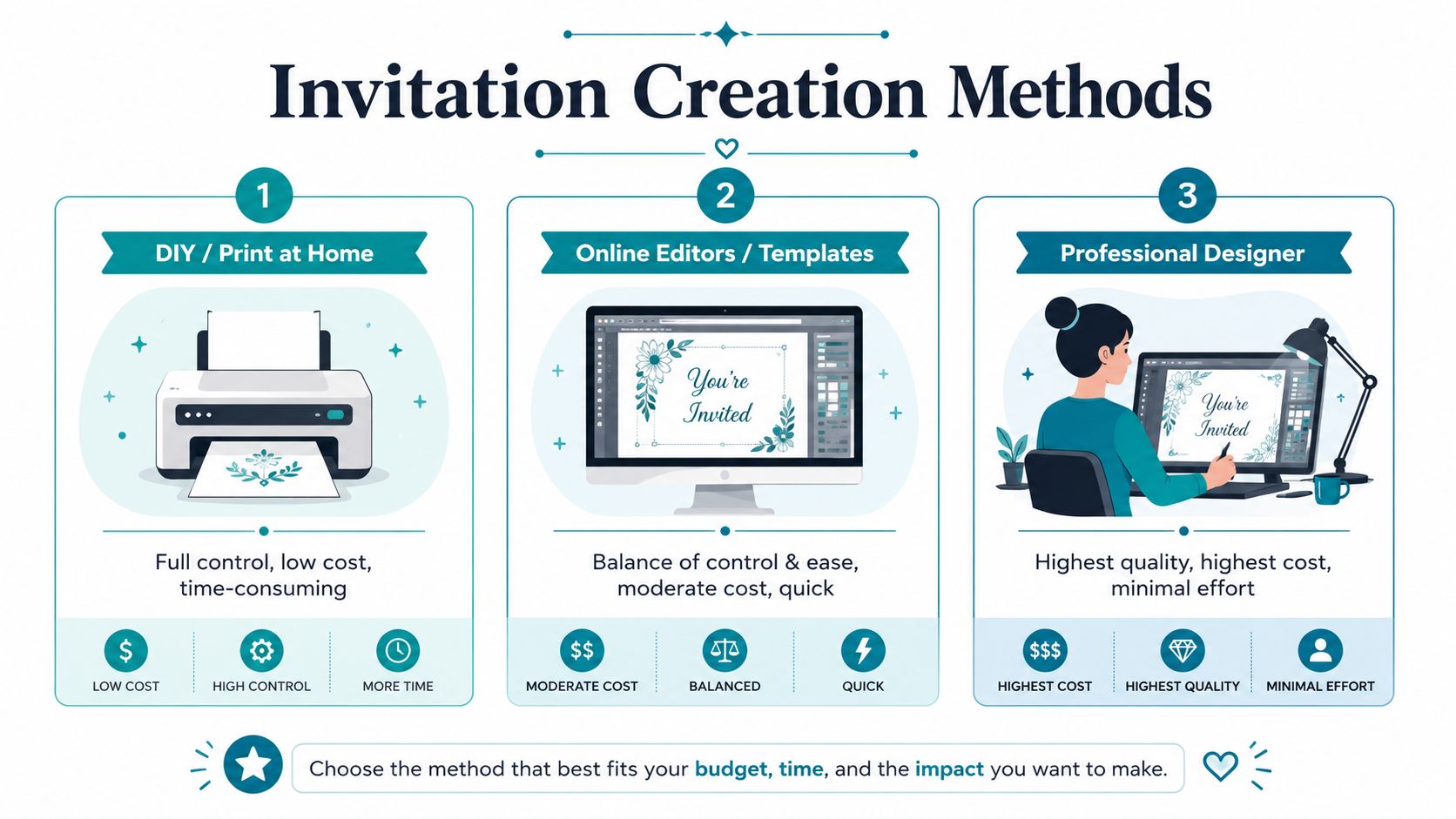
Three routes that suit different hosts
DIY and print at home
This is best for the host who likes control and already has some patience for design tools. Canva is the obvious starting point because it's simple, flexible, and full of editable invitation layouts. You can swap fonts, adjust colours, add your own illustrations, and print at home or through a local printer.
The trade-off is time. Small design choices take longer than expected. Matching colours, fixing spacing, and testing print quality can easily eat an evening.
DIY works best when:
- you enjoy making visual decisions
- you only need a small batch
- you're happy to test paper stocks yourself
Online editors and ready-made templates
This is the easiest middle ground. Platforms and marketplaces such as Etsy template shops or online card editors save a lot of decision fatigue because the structure already works. You choose a design close to your style, then personalise names, date, wording, and colours.
This route is ideal for hosts who want something polished without starting from a blank page. The main downside is compromise. If the template has a cute layout but the illustration style isn't quite right, you may not be able to change much.
Professional designer or print service
This option suits the time-poor host, the detail-focused planner, or anyone organising a larger, more formal shower. A designer can create a fully coordinated set with matching inserts, envelope liners, signage, and thank-you cards.
The quality is usually the highest. So is the cost. It also requires clear communication at the start, otherwise revisions can drag on.
Invitation creation methods compared
| Method | Best For | Avg. Cost (per 25) | Time Commitment |
|---|---|---|---|
| DIY / Print at Home | Creative hosts who want full control | Low | High |
| Online Editors / Templates | Busy hosts who still want a tailored look | Moderate | Low to moderate |
| Professional Designer | Formal events or hosts who want a premium finish | High | Low |
How to choose without overthinking it
Pick the method that matches your weakest point, not your strongest one.
If you know you're fussy about details but slow at design, don't force a full DIY project two weeks before the shower. If you're organised and visual, a template may feel restrictive. If you want printed cards but hate admin, a designer or full-service print platform may save your sanity.
A simple decision filter helps:
- Choose DIY if budget matters most.
- Choose a template if speed and style both matter.
- Choose professional help if finish matters more than cost.
The smartest invitation isn't always the fanciest one. It's the one you can finish properly, send on time, and feel good about.
Adding Personal Touches That Delight
The details guests remember are often the quiet ones. Not the loudest graphic or the trendiest phrase, but the small sign that someone took care.
Small additions with a big effect
A woodland invitation feels warmer when it arrives in an envelope lined with a leaf or star print that matches the party theme. A moon-and-stars design becomes more memorable when there's a tiny vellum wrap or a soft gold sticker keeping it closed. These aren't expensive upgrades. They just make the invitation feel complete.
A lovely touch for close family is a tucked-in keepsake. A wallet-sized scan photo, a short handwritten note, or a little tag that says “We can't wait for you to meet him” adds emotion without turning the invitation into a scrapbook.
Some invitations are read once. The thoughtful ones get pinned to the fridge.
Texture matters more than people think
If you're printing physical cards, paper choice changes the whole feel. Matte cardstock suits minimalist, modern designs. Textured stock works well for woodland or storybook themes. A slightly translucent vellum overlay softens a “soft boy” palette beautifully.
For hosts who want something more tactile, Custom Mark's emboss and deboss guide is a helpful primer on how raised or pressed details change the look of printed pieces. It's especially useful if you're considering monograms, initials, or a simple motif on the envelope flap.
Tie it back to the baby's space
The best personal touches often echo something beyond the event itself. If the nursery has stars, little geese, woodland animals, or a name motif, bring that into the invitation so guests sense a story rather than a one-off design. This is where personalised wall art for the nursery can spark ideas for motifs, name styling, and colour pairings that feel meaningful.
A good invitation says more than “please come”. It says, “this little person already has a place in our lives.”
From Invitation to Nursery Walls
A cohesive theme does more than make the shower look pretty. It creates continuity during a season that can otherwise feel full of one-off purchases. If the invitation introduces woodland animals, moons and stars, or muted gingham, those same ideas can carry naturally into the nursery and make everything feel more intentional.
That approach works particularly well for modern baby boy themes because softer palettes don't date quickly. A bear on the invitation can become a wall sticker. A script name from the card can inspire a personalised print. A moon-and-stars border can guide your choice of decals or labels. For parents who want the room to feel calm and child-led, it can also help to explore Montessori nursery concepts, especially when choosing decor that supports a simple, uncluttered space.
If you're continuing the look after the party, browse ideas for baby nursery wall stickers. The strongest nursery themes aren't over-designed. They repeat one or two visual ideas well and let the room breathe.
An invitation is often the first designed piece of your baby's world. It's worth treating it like the beginning of something, not just an event admin task.
If you're ready to carry your invitation style into the nursery, Quote My Wall has wall stickers, personalised prints, and nursery decor details that make it easy to build a calm, coordinated space without a full room overhaul.