
Clothing Labels Design: A Practical UK Guide
It's Sunday evening, the uniform pile is still damp, and you're staring at two identical navy jumpers trying to remember which one came home from lost property last term. Or you're sorting a care home laundry basket where three cardigans look exactly alike. That's the moment clothing labels design stops being about cute motifs. It becomes a practical question. Can you read the name at arm's length, will it stay stuck through the wash, and will the garment still be usable when it's handed on?
Pick a Size That Stays Readable
Start with dimensions, not artwork. If the label is too small, no font will save it. If it's too tall for a collar, it'll fold, crease and lift.
Stick-on clothing label sizes
| Use | Size and type | Best on |
|---|---|---|
| Single-line name | 45 by 12 mm, one line | Polo collars and vests |
| Name plus short code | 50 by 20 mm, two lines | Jumpers and coats |
| Initials only | 22 mm circle, two or three initials | Socks and tiny tags |
| Curved surface strip | 40 by 10 mm, short strip | Shoes, bottles, pencil cases |
| Communal laundry | 55 by 22 mm, high contrast | Care-home clothing |
Pick the row that matches the garment or item, then use its size and type as the brief. Don't shrink a two-line design into a single-line strip to save space. You'll end up with type that looks fine on screen and fails on fabric.
Corners, margins and curves
Use rounded corners with a 2 to 3 mm radius. Sharp corners lift first because they catch on other garments, fingers and washing machine drums. A rounded edge gives the adhesive a better chance and feels smoother against skin.
Keep a 1.5 mm blank margin inside the cut line. Letters that run to the edge look sliced if the cut shifts slightly, and they lose contrast once the label bends. That margin is your safety zone.
Curved surfaces need a different shape. A bottle, shoe heel or pencil case lid doesn't want a tall badge. It wants the 40 by 10 mm strip, applied along the curve so the ends aren't fighting to spring flat. If you're labelling bags as well as clothes, compare label sizes for school bags before you lock one size for everything, because a flat bag panel can take a larger label than a polo collar can.
The fibre label limit you can't design around
A stick-on name label is a separate name field. It must not cover or replace the garment's original fibre content label. UK Government textile labelling guidance expects fibre information to use legally recognised fibre names in descending order by weight, and to stay durable, legible, visible, accessible and securely attached where a label is used. Components with different compositions, such as a shell and lining, need their compositions identified separately.
That matters even for personalised school and care home labels. If you stick your name label over the fibre label, you've hidden information that the next owner, a charity sorter or a recycler may need. Keep the two labels separate, especially on blended garments.
Practical rule: If you can't read the original composition after your label goes on, you've placed it wrong.
Common slips are predictable. People use an informal fibre word, omit a lining percentage, put percentages in the wrong order, or print type so small it fails after normal use. Those aren't design preferences. They're specification errors.
Choose one row from the table now and write its millimetres on your brief. For example, Maya K, 45 by 12 mm, single line for polos and vests. Or Joan P plus laundry code, 55 by 22 mm for communal laundry. Once that size is fixed, every later choice about wording, type and finish has a real space to fit into.
Personalise for School and Care Homes
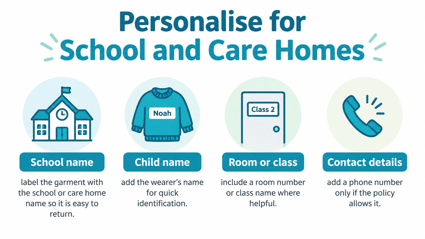
A jumper lands in lost property with a first name inside the collar and a year group printed underneath. The name identifies one child this term, but the extra detail stops the garment being useful next term. Treat the label as an identification field, not a motif.
School uniform is a significant cost for families, as UK Government school uniform cost news sets out, so a lost jumper becomes a replacement bill rather than a small annoyance. A label that only works for one term adds to that bill.
What to print by setting
| Setting | Print this | Leave this off | Why |
|---|---|---|---|
| Primary school | First name and surname initial | Class year and nickname | Garment can move to the next child |
| Secondary school | Surname or initials | Home address or full contact line | Enough for lost property, less exposure |
| Sibling hand-me-down | Family surname only | Child-specific nickname or crest | Next wearer is not labelled as someone else |
| Care home | First name plus room or laundry code | Photograph and medical detail | Staff sort quickly without extra personal data |
| Bottles and stationery | Same short name as the clothes | A different style per item | One system across the bag |
For primary lost property, first name plus surname initial is usually enough. Staff can return it, children can recognise it, and you haven't printed a full identity on a garment that may sit in a public box. For older pupils, surname or initials often work better. They're discreet and don't mark the garment as belonging to a much younger child.
Sibling hand-me-downs need a different decision. If a jumper will move from one child to the next, print the family surname alone. A younger sibling shouldn't have to wear an older child's nickname inside the collar. The same logic applies to second-hand purchases. A short surname is easier for the next family to cover or work around than a crest, a year and a pet name.
For a Year 3 polo likely to be passed on, Maya K does the job. It identifies the polo now without tying it to Year 3 forever.
Care homes need speed and dignity
Care home laundry is a sorting problem. Staff handle mixed loads, similar colours and garments that are washed often. They need to identify a cardigan quickly without turning it inside out and squinting at tiny type.
A readable first name plus a room or laundry code beats a full name, photograph or medical detail. For a care home cardigan, Joan P / Blue laundry gives staff a fast sort. The resident isn't carrying unnecessary personal information on clothing that sits in a communal basket.
Distinguish clothing from bedding or soft items with a short code, not a bigger logo. A code takes less space, reads faster and avoids turning every item into a different design. Consistency matters more than decoration when a basket holds similar-looking garments.
Delete any word that would embarrass the wearer or stop the next owner using the clothes.
If you're working through school items as a full set, this guide to school clothing labels is useful for matching wording across uniforms, shoes and bags. Keep one short identifier across everything. A child, a teacher and a laundry worker should all be looking for the same string of characters.
Don't add a phone number unless the school or care home policy allows it and you've thought about where the garment will be seen. A contact detail that helps in lost property can expose more than you intended on a bottle or lunchbox. When in doubt, leave it off and make the name easier to read.
Lay Out Type Colour and Icons
Once the size is fixed, layout is a set of small decisions that protect readability. Use Maya K as the test string. If the surname initial disappears, the layout has failed, even if the first name looks attractive.
Numbered layout steps
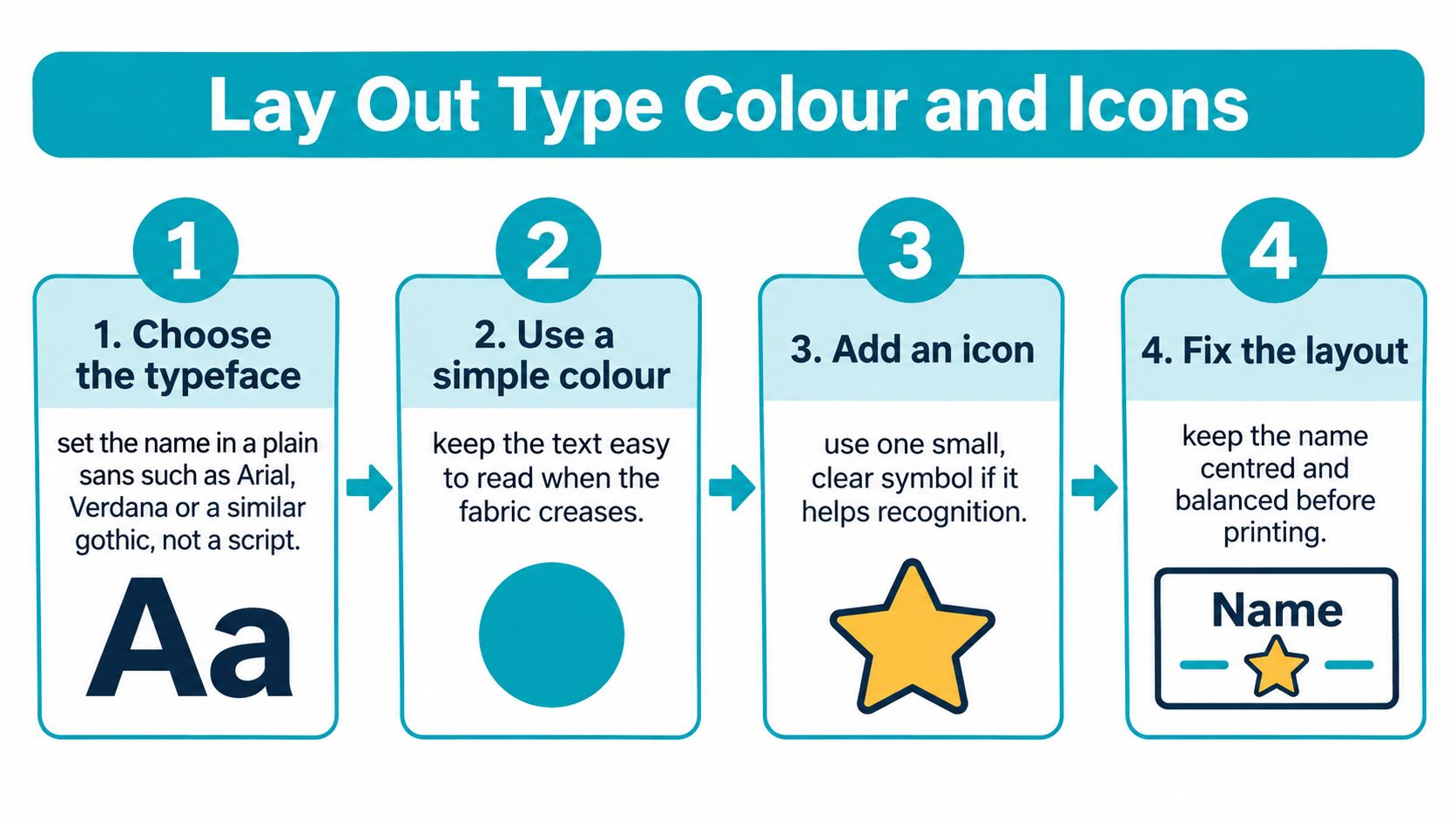
- Choose a plain sans. Set the name in Arial, Verdana or a similar gothic. Don't use a script. Scripts rely on thin joins and decorative strokes, and they break up once fabric creases. This step prevents the most common failure, a name that's elegant on screen and unreadable on a polo.
- Keep the text string short. Use first name plus surname initial unless the setting needs a laundry code. Don't add a class year to fill space. Extra words force smaller type and reduce the garment's reuse value.
- Set a minimum type size. Use at least 8 pt on a 12 mm label and 10 to 12 pt on a care-home label. Open the tracking slightly so letters don't merge. Avoid outline strokes, because they fill in counters and make e, a and s harder to separate.
- Pick one high-contrast pair. Use one dark colour on a light ground, or white on a deep ground. Black on white and white on navy are the safe pairs. Mid-grey on heather fabric disappears, especially under warm indoor light. This step prevents a label that vanishes against the garment it's meant to identify.
- Keep a second colour away from the name. If you want another colour, use it for a 3 mm icon or a thin rule. Don't set the name itself in a pale accent colour. Decoration should support recognition, not compete with it.
- Place the icon to the left. Leave a 1 mm gap between icon and name. Skip mascots that eat more than a quarter of the width. A large football, unicorn or crest steals millimetres from the letters, and letters are the functional part.
- Align to the optical centre. Don't rely only on the mathematical centre. Rounded corners steal visual space, so a label can look off balance even when the measurements are equal. Nudge the text until it looks centred in the safe area.
- Print a paper proof at 100 percent. Hold it at arm's length in average room light. If you can't read the surname initial straight away, reject it. Don't approve a proof by zooming in on a bright screen.
Slips that keep recurring
- Reversed white text on a pale polo: It may appear on your monitor because the screen adds brightness. On fabric, there's no contrast to rescue it.
- A crest that crowds the name: The eye goes to the badge first and the identifier second. Lost property needs the opposite order.
- A nickname as the main text: It might be loved at home and unhelpful in a classroom, and it blocks a sibling hand-me-down.
For a deeper look at letterforms, spacing and weights, this guide to choosing fonts for name labels helps you compare options without guessing. I would choose the plainer font every time if the garment will be washed weekly. Fine serifs and handwriting styles don't gain anything once the label flexes.
Arm's length test: If Maya K can't be read in two seconds, change the type size or contrast before you add another colour.
Finish with a locked text string you can paste into the file. For the worked example, that's Maya K, with no class, no nickname and no extra punctuation. For care laundry, lock the two-line version exactly as staff will use it, such as Joan P on line one and the laundry code on line two. Typing it again from memory at order stage is how spelling errors get printed.
Make a Print-Ready File and Finish
Build the file only after the type is approved. The first decision is production method, because plotter-cut vinyl and digital print don't want the same artwork.
For plotter-cut vinyl, supply vector artwork as PDF or SVG, with live text outlined so the font can't substitute. Add 1.5 mm bleed if colour floods to the edge. For a digitally printed sticker, supply PDF or a high-quality PNG at 300 dpi at the final millimetre size. Use CMYK for print, and keep an RGB preview only for screen checks. A 50 mm label saved at a vague large size isn't print ready. It needs its real dimensions in the file.
File setup that avoids rework
- Crop marks outside the cut: Marks inside the label area can print or confuse the cut path. Keep them clear.
- 3 mm quiet border: This protects the design from looking cramped and gives the cutter tolerance.
- No hairlines under 0.25 mm: Very fine rules break up, fill in or disappear after printing and cutting.
- File name with size and colour: Use a name such as maya-k-50x20-navy.pdf. You'll thank yourself when you reorder.
If you've prepared artwork for other garments, a hat logo file preparation guide covers the same basic discipline of clear artwork, correct sizing and production-ready files. The product differs, but the rule is the same. A printer can't fix a tiny, blurred file by cutting it neatly.
Finish choices for stick-on name labels
| Finish | Look and feel | Use it on | Avoid unless tested |
|---|---|---|---|
| Gloss vinyl | Smooth, strongest contrast, wipes clean | Navy jumpers and dark coats | Pale fabric where glare hides type |
| Matte vinyl | Low glare, slightly softer sheen | White and grey polos | Very dark grounds needing white type |
| Thin high-tack film | Flexible, strong bond, low profile | Cotton and polycotton uniforms | Waterproof coatings and silicone prints |
| Any stick-on on a curve | Same films, shorter strip | Shoes, bottles, cases | Ribbed cuffs, seams and heavy nap |
Match the finish to the fabric, not to the colour you liked on the order page. Gloss can give strong contrast on a dark jumper and wipe clean easily. On a pale polo, glare can make grey type harder to read. Matte reduces that glare but can look softer on very dark grounds where white type needs maximum punch.
A thin high-tack film suits cotton and polycotton because it flexes with the garment and sits low against the skin. Smooth, low-profile edges matter on children's clothing and care garments that are handled often. A thick, raised edge is easier to pick at and more likely to snag.
Flag difficult surfaces before you order a full sheet. Waterproof coatings, silicone prints, heavy fleece nap, ribbed cuffs and seam tape all need a sample first. They reduce contact area or stop adhesive gripping evenly. If the label only touches the tops of ribs or fleece fibres, the bond starts weak.
A domestic iron-on transfer is a different product. It's outside this stick-on specification, with different heat, pressure and fabric limits. Don't mix instructions between the two.
If you want a starting layout before building your own file, this clothing label template guide gives you a structure to adapt. Keep the template subordinate to your locked size and text string.
Close with a three-line handoff note. Line one gives size, line two gives colour mode, and line three gives finish. For example, 50 by 20 mm, CMYK PDF, matte vinyl. That note belongs on the order form, in the file name and in any email to the printer.
Stick On and Wash Without Peel
Placement decides whether a good label survives. For shirts and dresses, use inside the back neck on a flat woven panel about 10 mm below the collar seam. Trousers take the side seam area. PE shorts can take the inside hem when the neck or waistband is ribbed.
Keep the label clear of the fibre label, care symbols, seams and any area that folds every time the garment is worn. For shoes, use the tongue or insole heel, not the flex point where the shoe bends with every step.
Application steps
- Wash and dry a new garment once. This removes sizing residue that can weaken the bond. Don't apply to damp fabric.
- Wipe the spot and let it dry. Dust, fluff and fabric softener residue reduce contact.
- Peel the backing without touching adhesive. Fingerprints and picked corners create weak points.
- Press from the centre outward for 20 to 30 seconds. Include the corners. Centre-out pressure pushes air away from the bond.
- Leave the bond for the time the maker states. That's often several hours before the first wash. Don't test it by peeling an edge to see if it's stuck.
Prove it with your own wash
Don't assume a generic washable claim covers every fabric. Retained EU textile labelling legislation on legislation.gov.uk requires information to remain durable and easily legible, and it does not provide a universal wash-cycle success-rate benchmark. Claims such as washable or tumble-dryer safe need product-specific testing rather than assumption from adhesive type.
Test on one garment of the fabric and finish. Use the detergent, temperature and drying method you use. Tumble dry the sample only if that's the normal cycle. Inspect for lifting corners, cracking, fading, migration, lost contrast and abrasion from rubbing or folding.
Wash test checkpoints
| Checkpoint | What to inspect | Record |
|---|---|---|
| Immediately after bonding | Lifting corners, edge alignment | Pass or fail with date |
| After first wash | Lifting, cracking, fading | Pass or fail with wash settings |
| After several cycles | Migration, lost contrast, abrasion from folding | Cycle count and result |
Record what you tested. Fabric, wash temperature, detergent, drying method and cycle count matter more than a memory that it seemed fine last week.
A label that passes on a cotton polo can still fail on a coated coat. Don't copy one result across every item.
Skin-side labels should stay smooth and thin. If an edge lifts, don't press it back down and hope the dryer will seal it. It usually won't. Remove the failed label if it comes away cleanly, choose a flatter spot, and apply a fresh one. Repeatedly sticking down a lifted corner traps fluff under the adhesive and makes the next failure faster.
Confirm the Order Before You Print
Tick the order against decisions you've already made. Don't redesign at checkout because a new colour or motif catches your eye.
Final checklist
- Cut size: It matches the table row for the garment or item, in millimetres.
- Exact text: It uses the locked string, with no year group or nickname unless you chose one on purpose.
- Contrast pair: It's dark on light or light on dark, and it passes at arm's length.
- File: It's outlined vector or a 300 dpi PDF at final size.
- Finish: It's matched to the fabric, not just to the garment colour.
- Placement: It will sit clear of the fibre label and care symbols.
Quantity needs the same practical thinking. A child with a full uniform and PE kit often needs several dozen labels once bottles, shoes and pencil cases are included. A care home should order by resident and keep a spare sheet for replacements, new garments and laundry changes. Running out mid-wardrobe creates a mix of handwritten marks, old labels and unlabelled items, which is exactly what the system was meant to avoid.
Peel-and-stick labels avoid sewing and ironing. That suits a parent labelling a uniform pile the night before term, and it suits staff working through a resident's wardrobe without sending every garment away for stitching. Speed matters, but only if the bond and placement are right. A fast label in the wrong place is still a failed label.
Quote My Wall is a UK supplier of stick-on clothing labels for school and care home use, with 66 personalised labels listed at £6.29. Check current pricing and pack options on the site before buying, and match the pack size to your checklist rather than buying the smallest sheet by habit. Its labels use ultra high tack adhesive and are described as fully washable and safe for dishwashers, tumble dryers and microwaves, so the same ordering decision can cover clothes and hard items.
I would order the plainer design if there's any doubt. A readable surname on a plain ground will still be doing its job when a decorative version has faded into the fabric or been covered because the next child has a different nickname. Clothing labels design succeeds when the garment comes back to the right person, wash after wash.
If the proof fails the arm's-length read, change the text before adding more colour.
Quote My Wall offers personalised ultra high tack stick-on clothing labels for children's school clothes and care home clothing, with no sewing or ironing needed. Choose your locked name, size and finish from the checklist above, then visit Quote My Wall to order a pack that matches your uniform or laundry list.