

Certificate of Appreciation: Write, Design and Print One
You've got the call, the speaker is ready, and someone has asked for a certificate of appreciation that doesn't look like it was knocked up in five minutes. That's usually where people get stuck. They know the words should be warm, but they also know the paper, layout and handover matter if the certificate is going to be framed, pinned on a noticeboard or kept in a folder instead of ending up in the bin.
A good certificate does more than say thank you. It gives a dated record of recognition, which matters because Gallup reports that about 65% of employees worldwide say they received no recognition in the previous year, and it specifically lists recognition via an award, certificate or commendation among the most memorable forms of appreciation (Gallup recognition data). In practice, that means the certificate isn't just decorative. It closes a real recognition gap in a way that feels formal without being expensive.
If you're working through wording for a school volunteer, a retiring colleague, a care home resident or a small business partner, the safest place to start is with a clear purpose. A certificate is the right choice when you want the acknowledgement to be public, dated and durable. A quick thank-you note or a verbal mention is fine for smaller moments, but a certificate makes sense when the occasion itself deserves a record, not just a polite nod. For broader recognition ideas that sit alongside certificates, the guide on gift platforms for makers is useful context because it shows how formal appreciation fits into a wider thank-you system.
What a Certificate of Appreciation Does
A certificate works best when the moment has weight. That might be a retirement, a volunteer season ending, a school project completed, or a team member being recognised in front of colleagues. In those settings, the certificate does two jobs at once. It says thank you, and it also creates a document that can be kept, displayed or filed as evidence that the contribution was noticed.
Formal recognition, not just nice wording
Gallup's recognition research is useful here because it shows the problem employers are trying to solve. If about 65% of employees worldwide say they got no recognition in the last year, then recognition cannot rely on memory or casual praise alone. A certificate gives structure to something that can otherwise stay vague. It marks a moment, names the recipient and records the reason.
That matters in UK workplaces, schools and community groups where people often want something tangible. A handwritten card can be lovely, but it does not always carry the same sense of formality when the person is being thanked publicly. A certificate does, especially when it includes the recipient's name, the reason for recognition, the date and the issuer.
Practical rule: use a certificate when you want the thanks to be remembered, not just appreciated in the moment.
There is also a simple status point. A certificate feels deliberate. It looks like the organisation planned the recognition rather than improvising it. That is why it works so well for milestones and group acknowledgements, where a dated record carries more meaning than a generic note. If you are used to giving branded keepsakes or small gifts, the corporate thank you gift ideas page is a helpful reference point for matching the formality of the gesture to the occasion.
A certificate also helps when the recognition needs to travel. It can be handed over at an event, slipped into a folder, or framed on a wall without losing its point. That makes it more useful than words alone when the result needs to last beyond the room.
For broader context on how formal appreciation sits alongside other recognition formats, the guide on gift platforms for makers is useful background, especially if you are comparing certificates with other keepsakes that people are likely to keep.
Matching the Tone to the Occasion
The wording should change with the setting. A retiring employee shouldn't get the same line as a school volunteer, and a care home resident needs a warmer, more personal register than a business partner. What stays consistent is the core structure, the recipient's name, the achievement statement, the organisation name, the date and the signature. What changes is the emotional tone and how specific the contribution sounds.
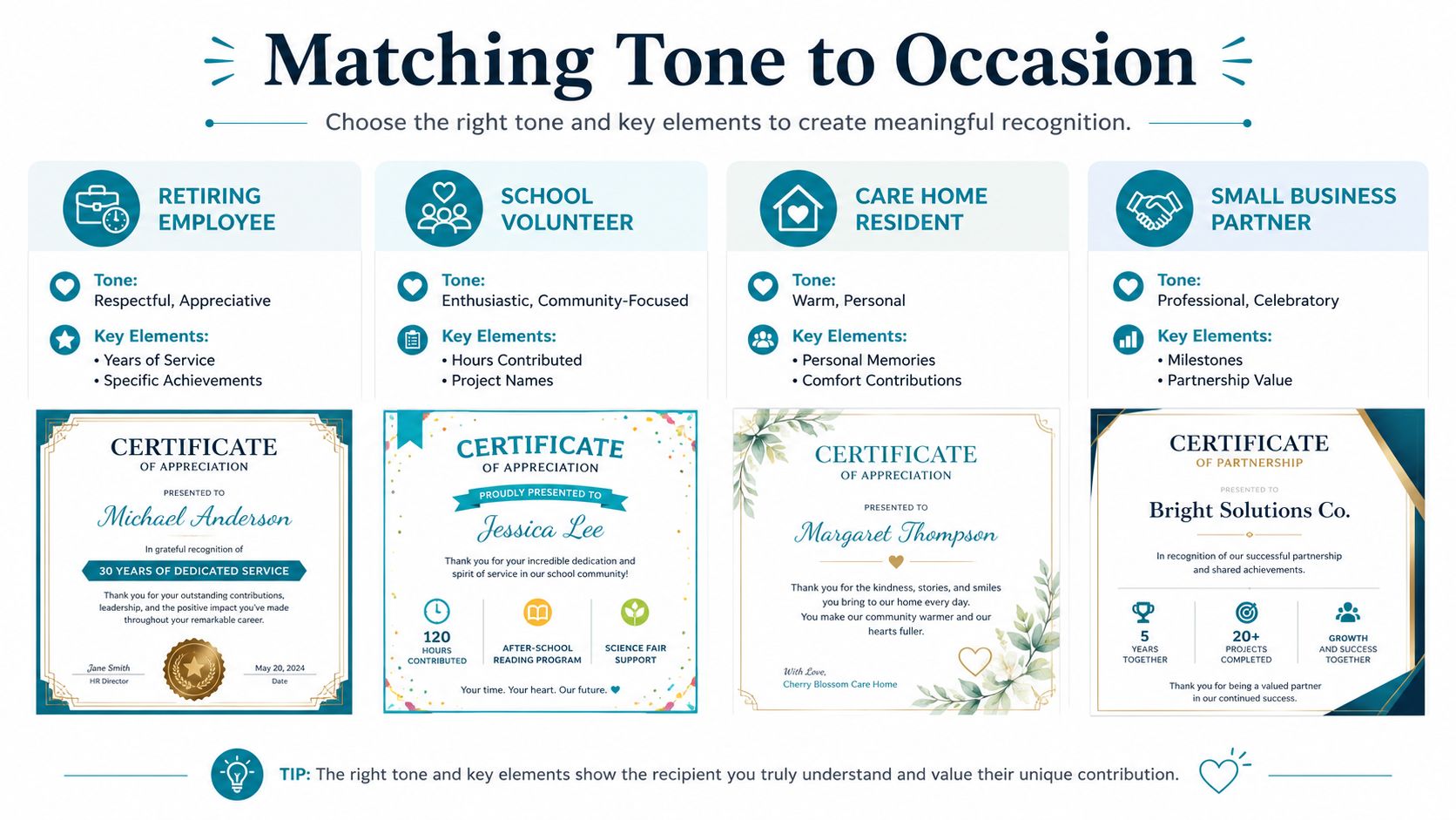
Different occasions need different registers
A retiring employee usually needs respectful, steady language. A line like “In recognition of your dedicated service and lasting contribution to the team” sounds appropriate because it's measured and formal.
A school volunteer can take a brighter tone. “With heartfelt thanks for your time, energy and support at our reading club” feels warmer and more community-focused.
A care home resident benefits from personal language that feels human. “In appreciation of the kindness, encouragement and comfort you bring to those around you” sounds more intimate and gentle.
A small business partner often needs professional confidence. “In recognition of your valued partnership and the milestones we've achieved together” keeps the emphasis on collaboration.
| Occasion | Tone | Detail level |
|---|---|---|
| Retiring employee | Respectful, appreciative | Specific service, contribution and date |
| School volunteer | Enthusiastic, community-focused | Project names, events or classes supported |
| Care home resident | Warm, personal | Personal qualities and everyday impact |
| Small business partner | Professional, celebratory | Shared milestones and partnership value |
The strongest certificates avoid overdoing the sentiment. They sound sincere because they name the actual contribution. That's also why a source like certificate wording examples is useful for spotting tone differences, even though most template sites stop short of explaining what to do in a real UK setting.
Writing the Wording That Lands
The cleanest certificates start before the design work. Get the details first, full name, exact contribution, dates, organisation name and authorised sign-off. If any of those are missing, the certificate will look unfinished no matter how polished the layout is. The wording should read smoothly when spoken aloud too, because many certificates are presented in front of a room.
Build the sentence around the contribution
A weak line says, “Thank you for everything you do.” It's polite, but it could apply to almost anyone. A stronger line says, “In recognition of your support during the spring fundraising campaign and the time you gave to every shift.” That version has a subject, an action and a reason.
The difference is specificity. Guidance on wording keeps coming back to naming the exact contribution, the issuing organisation and the date, and that's because generic praise doesn't hold up well on paper. If you're recognising someone at a public event, you want the message to sound natural, not inflated. A long sentence stuffed with praise usually reads worse than a short one that gets the point across clearly.
Keep it simple: say what was done, who it was for, and why it mattered.
One practical issue people forget is layout testing. Long names, double-barrelled surnames and special characters can shift spacing in ways that ruin an otherwise solid certificate. I've seen a neat design fall apart because the recipient's name pushed the title into the border. Test the full text before export, especially if the certificate is going to be printed in batches.
For wall-ready wording and display-friendly phrasing, the quotes for walls stickers article is a useful companion because it shows how short lines work when they have to carry visual weight. The same principle applies here, keep the wording readable, balanced and specific.
Designing a Certificate That Looks Worth Keeping
Design is where certificates usually lose credibility. Too many fonts, a crowded border, pale text and a stretched logo make even a sincere message feel cheap. The best certificate looks calm. It gives the eye a clear route from the title to the recipient's name to the wording and then the sign-off.
Use restraint, not decoration overload
Treat the recipient's name as the focal point. Everything else should support it, not compete with it. A strong layout uses no more than two fonts, with enough contrast between the title and the body to create hierarchy. The body text should be at least 12 pt, and the colour contrast should meet 4.5:1 for normal text and 3:1 for large text so the certificate stays readable in both digital and printed form (certificate design guidance).
White space matters more than extra ornament. A wide margin and a clean border make the certificate look deliberate. A border should frame the page, not crowd it. If you add a crest, logo or brand mark, keep it small enough that the recognition message still leads.
A simple structure that holds up
The most reliable layout is basic, and that's not a weakness.
- Title at the top, clear and centred.
- Recipient name below, larger than the rest.
- Achievement line in the middle, short and specific.
- Organisation name and date near the bottom, balanced with the signature.
- Signature or authorisation line, small but visible.
That layout survives framing, photocopying and archiving better than decorative templates packed with flourishes. It also works across sectors, which matters if you're producing certificates for schools, care homes or local businesses with very different brand styles.
For examples of how visual structure changes across printed pieces, the custom wall art prints page is a handy comparison point. It shows why clean alignment and spacing matter just as much on a certificate as they do on display artwork.
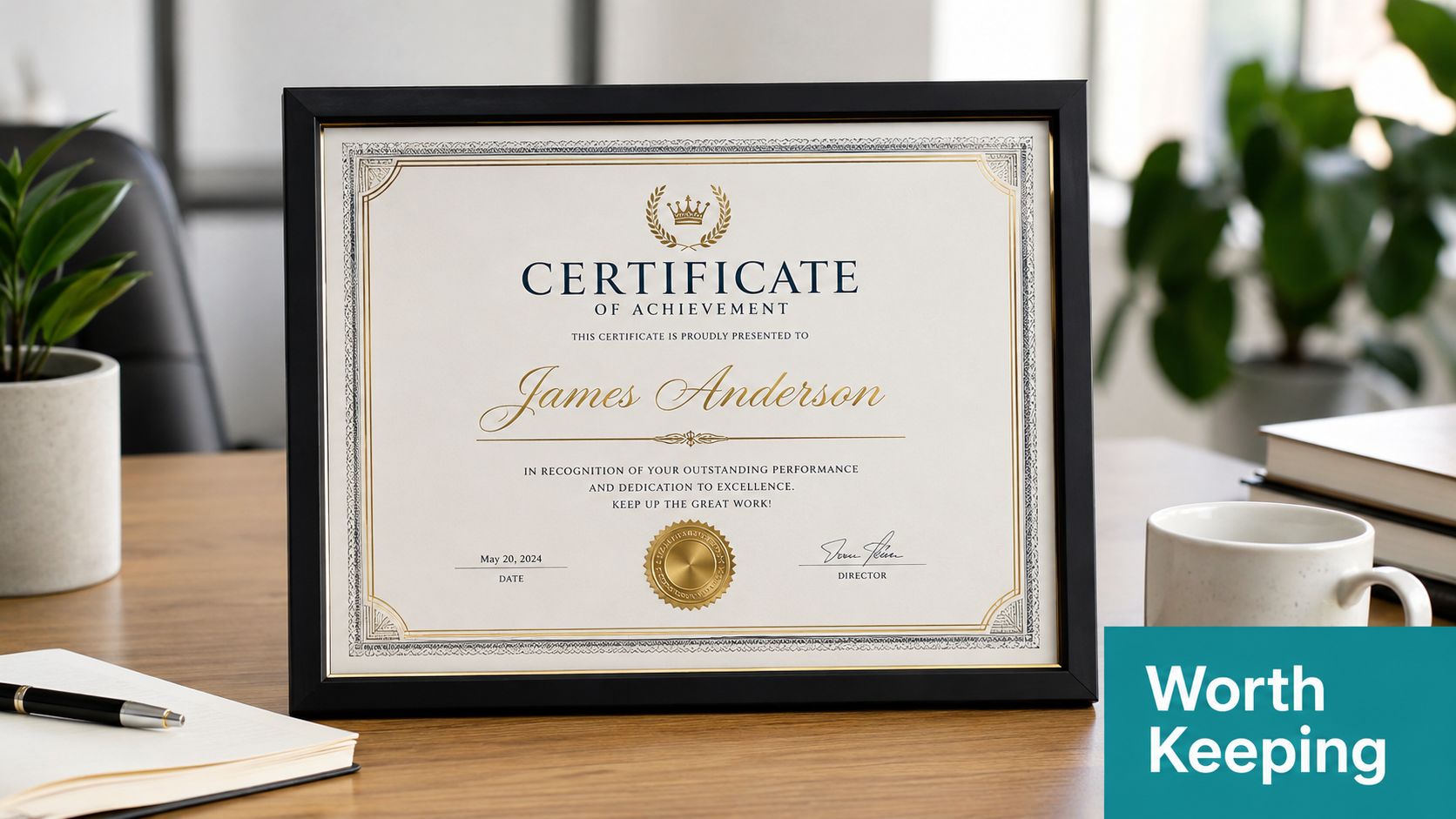
Choosing Paper, Card and Personalised Vinyl
What the certificate is printed on changes the whole feel of the recognition. Thin paper behaves like a handout. Heavy card feels more like an award. In schools and offices, that difference is obvious the moment someone picks it up. The right choice depends on whether the certificate is meant to be framed, carried home, posted, or handled often.
Compare the production options honestly
| Material | Finish | Durability | Best For |
|---|---|---|---|
| Standard printer paper | Plain, light, economical | Low | Internal notes, draft proofs, very informal use |
| Heavy card | Firm, clean, familiar | Medium | Most schools, workplaces and community awards |
| Premium textured card | More tactile, more formal | Medium to high | Retirements, leadership awards, special events |
| Laminated card | Glossy or sealed surface | High | Frequent handling, display, multi-use environments |
| Personalised vinyl print | Wipe-clean, durable, custom finish | High | Care homes, nurseries, kitchens, outdoor or high-contact settings |
A plain sheet is cheap, but it often looks disposable. Heavy card is the standard for a reason, it gives enough body to feel intentional without looking overproduced. Premium textured card is worth it when the certificate needs to feel keepsake-worthy. Laminated card is practical where people will handle it often, though it can feel less elegant than a good matte card.
Personalised vinyl is the outlier, but it has real use cases. In care settings, kitchens or busy communal spaces, a wipe-clean surface survives far better than fragile paper. That durability matters when the certificate is part of a display rather than a one-off handover. For background on the material side of this, the vinyl for wall art article helps explain why vinyl stands up well in demanding environments.
The trade-off is simple. If the certificate is going straight into a frame, choose card. If it needs to survive repeated contact or moisture, vinyl makes sense. If it's only being used for proofing or internal review, paper is enough. The material should match the message, because a flimsy sheet makes a meaningful award feel forgettable.
Presenting the Certificate So It Counts
A certificate can be beautifully written and printed, then lose most of its impact in the handover. I've seen excellent certificates get slid across a table in silence, and the moment lands flat. Presentation is part of the recognition, not an extra.
A real event makes the difference
At a charity dinner, the volunteer who has been helping all year shouldn't be handed the certificate at the very end while people are putting coats on. Better to present it when the room is still attentive, with a brief spoken line that mirrors the wording on the page. Something like, “We'd like to recognise the time and care you gave to this event and to everyone who benefited from it” keeps the verbal moment aligned with the printed one.
Whether you hand it over in a folder or flat depends on the setting. A folder feels formal and protects the certificate during the walk to the table. Flat presentation works well when a photo is being taken immediately. If the certificate is being posted to a care home resident or sent to a remote team member, the envelope should be sturdy enough that the paper doesn't crease in transit.
Virtual presentations are now common for distributed teams, and school assemblies still work because children understand the public handover. The same principle applies in each case, the recognition needs a visible moment, not just a document in circulation. If you're planning the event around the handover, the appreciation event planning tips resource is a useful reference for timing and presentation ideas without overcomplicating the occasion.
Final Checklist and Common Mistakes to Avoid
Before anything goes to print, check the content, the design and the finish together. A certificate feels professional when all three are aligned. Miss one, and the whole piece starts looking token.
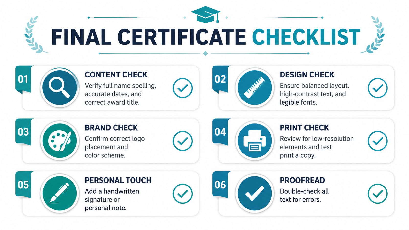
Use this last pass before printing
- Content check: spell the full name correctly, confirm the date, and make sure the contribution is named clearly.
- Design check: keep to two fonts or fewer, keep the recipient name dominant, and check the contrast on screen and on paper.
- Brand check: place the logo or crest neatly and don't let it overpower the message.
- Print check: test one copy first, especially if the certificate uses heavy card or a special finish.
- Personal touch: add a signature, initials or a short handwritten note if the format allows it.
- Proofread: read every line out loud once before signing off.
The recurring mistakes are easy to spot. Generic praise makes the certificate forgettable. Missing the organisation name weakens credibility. Leaving off the date turns the certificate into a loose compliment instead of a record. Busy borders fight the typography, and thin paper crumples before the recipient gets home.
The best certificates feel worth keeping because the wording, design and material all support the same message. They look intentional in the hand and credible on the wall. If you're ready to produce one that holds up at the event, get in touch with Quote My Wall and choose a finish that matches the recognition you want people to remember.