
Acrylic Wedding Signs UK: Styles and How to Choose
You've found an acrylic welcome sign that looks perfect in a photograph. The lettering matches your invitations, the flowers frame it beautifully, and you can already see it outside your venue. Then come the practical questions: will guests read it, will the stand stay upright, and what happens to the panel afterwards?
Choosing acrylic wedding signs in the UK is easier when you start with the guest's view rather than the product photograph. Decide what someone needs to read, where they'll stand and what the lighting will be like. Then confirm the design with a full-size mock-up before ordering.
Acrylic Wedding Sign Styles and Where Each Works
A frosted or matt acrylic panel with dark lettering is the safest starting point for most UK venues. Clear acrylic with vinyl lettering gives a more minimal, floating effect, but it's better suited to daylight photo backdrops than essential information under reception spotlights.
Choose by reading distance first. A bar menu read close up can carry more detail than an order-of-the-day board viewed across a room. A seating plan also needs enough space for guests to find names without gathering tightly around the easel.
Acrylic wedding sign styles by setting
| Style | Typical Look | Best Setting | Readability Note |
|---|---|---|---|
| Clear acrylic with vinyl lettering | Minimal, see-through, layered | Photo backdrops and entrance signs in daylight | Glossy reflections under spotlights |
| Frosted or matt acrylic | Soft, diffused, modern | Seating plans and welcome signs in mixed lighting | Lower glare; easiest for most guests |
| Coloured tinted acrylic | Bold, saturated, colour-matched | Bar menus and colour-coordinated venues | Contrast drops if light lettering blends into the tint |
| Opaque backed acrylic | Solid colour panel, no see-through | Directional and timetable signs | Strong contrast when lettering is chosen well; least transparent effect |
| Mirrored acrylic | Reflective, glamorous, statement | Photo corners and evening receptions | Reflections can hide text; use for décor only |
The Office for National Statistics recorded 224,402 marriages in England and Wales in 2023, excluding civil partnerships. That establishes the scale of wedding occasions, not how many couples bought acrylic signs.
Match the finish to the job
For an entrance, consider what sits behind the panel throughout the day. Pale lettering might look lovely against a dark hedge but disappear when the sign moves inside against a cream wall. An opaque backing removes that changing background from the design.
A memorial display is different. Guests can approach it, so restrained personal wording and a softer finish may suit it better than a large, attention-seeking layout. Keep any explanatory message easy to find.
You can coordinate colours without using the same material everywhere. Princess Apulia®’s guide to wedding paper details abroad is useful when connecting destination-wedding stationery with reception décor. For celebrations before the wedding, these bridal shower decoration ideas offer another opportunity to develop a consistent palette.
Practical rule: Choose matt for essential information under spotlights. Save clear, tinted or mirrored panels for decorative moments where reading isn't the main task.
Readability Under Real Venue Lighting
A clear seating plan can look crisp beside a window and become difficult to read beneath a ceiling spotlight. Guests see the reflected light instead of the names, even though the lettering colour hasn't changed.
Light Reflectance Value, usually shortened to LRV, describes how much light a surface reflects. VisitBritain's accessibility guidance recommends at least 70 LRV points between lettering and its background, at least 30 LRV points between the signboard and mounting surface, and matt or non-reflective temporary signage. Treat these as design guidance, not a wedding-specific legal threshold.
Readability specification for venue signs
| Check | Requirement | Source |
|---|---|---|
| Lettering against background | At least 70 LRV points difference | VisitBritain guidance |
| Signboard against mounting surface | At least 30 LRV points difference | VisitBritain guidance |
| Temporary sign finish | Matt or non-reflective | VisitBritain guidance |
| Lettering style | Large sans-serif, mixed case | UK event-accessibility guidance |
| Minimum letter height | Establish through a full-size viewing test | Not stated in source guidance; confirm with mock-up |
Test the layout and the material
Use a plain sans-serif typeface for names, directions and timings. Mixed case preserves familiar word shapes; elaborate calligraphy and gothic lettering make those functional messages harder to scan. Dark text on a light panel, or its reverse, is a sensible starting point.
Ask suppliers for LRV values for each proposed finish before comparing quotes. Clear material needs particular care because the visible background changes with its surroundings.
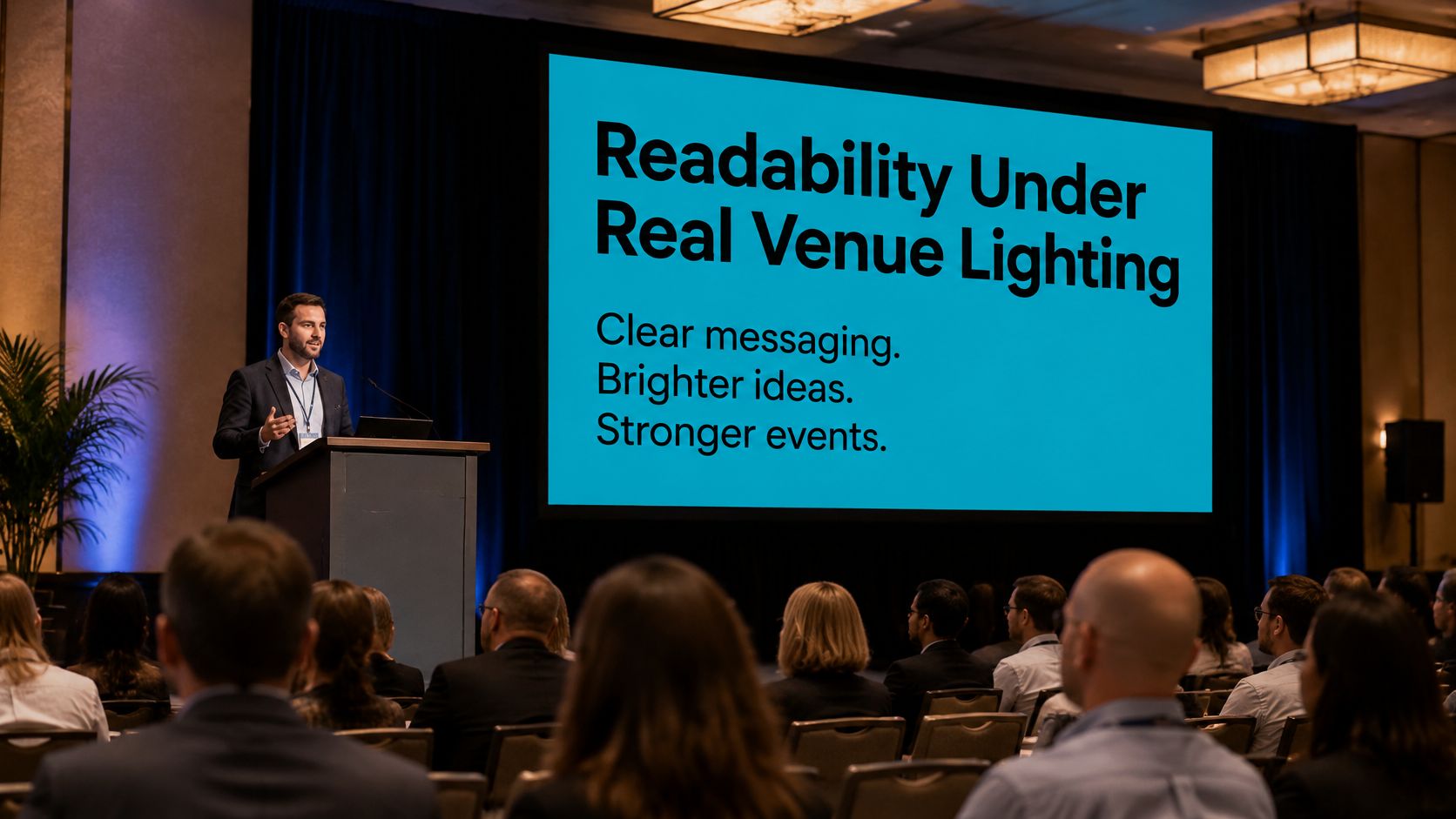
Bright event lighting is a reminder to test displays in their actual setting, rather than judging only a screen preview.
- Get the lighting details. Ask the venue which lights will operate when guests arrive and during the reception.
- Print at full size. Compare dark-on-light and light-on-dark versions without shrinking the artwork to fit ordinary paper.
- Stand where guests will stand. Read from the entrance and seating area under the intended lights.
- Choose the readable version. Then check a sample of the actual acrylic and lettering, because paper won't reproduce surface glare.
A mock-up tests layout and scale. A material sample tests reflections. You need both checks to approve the complete effect.
Personalisation Options and Their Trade-offs
Personalisation should help guests recognise the occasion without hiding the sign's purpose. Before adding a quotation, floral border or monogram, decide what someone needs to notice first.
On a welcome sign, that might be the couple's names. On a table marker, it's the table identifier. On a seating plan, decorative wording should leave room for the names people came to find.
Personalisation options and their readability risk
| Option | What It Changes | Readability Risk | Best Sign Type |
|---|---|---|---|
| Couple names in vinyl | Main identity of the sign | Low if set in clear sans-serif | Entrance welcome sign |
| Initials or monogram | Compact graphic mark | Low to medium with simple lettering; higher with intertwined forms | Bar menu or table sign |
| Wedding date and venue name | Context and keepsake value | Low when short and uncluttered | Memorial or keepsake panel |
| Custom wording such as Table 4 | Clear navigation for guests | Low when large and mixed case | Seating plan or directional sign |
| Script font | Romantic, elegant tone | High at distance and under glare | Short names on photo backdrops only |
| Colour matched to palette | Ties sign to the décor | Medium unless contrast is checked | Any style with a matt finish |
| Floral or illustrated graphics | Decorative detail | Medium to high over busy areas | Backdrops and non-essential panels |
Give each detail a clear role
Names in vinyl provide a clean focal point when the letter shapes are open and uncomplicated. Long names need more space, not tighter spacing. If the layout feels squeezed, remove secondary wording before making everything smaller.
A monogram uses little room, but intertwined initials can become a puzzle. Treat it as a decorative emblem, not a substitute for written instructions. Guests shouldn't need to decode a symbol to identify the bar or find their table.
Dates and venue names add keepsake value. Keep them subordinate to the message guests need on the day, and check spelling against the booking paperwork rather than relying on memory.
Custom wording should be direct. Find your seat is useful above a seating plan, but a long introduction can consume the space needed for readable guest names. Favourite quotations belong on panels intended for lingering, not at a busy decision point.
Coordinate without overcrowding
A wedding palette doesn't require every word to use the palest accent colour. Put that colour in a border, small illustration or nearby flowers while keeping functional lettering distinct. Floral graphics work best beside the text rather than beneath it.
For smaller coordinated details, custom wedding stickers can carry decorative motifs onto favours or packaging, leaving information signs less crowded.
Keep short-message signs to a clear main line and a restrained graphic where possible. Seating plans and menus need more content, so judge them by hierarchy and spacing rather than forcing an arbitrary line limit.
Before approving artwork, ask someone who hasn't helped design it to read the full-size version. If they hesitate over the main message, simplify it.
Guest Accessibility and Wayfinding Alternatives
A guest with low vision shouldn't have to ask someone else what an elegant sign says. Transparent acrylic can show flowers, patterned walls or passing people behind the lettering, so the background isn't necessarily the one you approved in the artwork.
Decorative signage and accessible wayfinding aren't interchangeable. The Registrar General's guidance for approved civil-ceremony premises requires notices identifying ceremony locations and providing directions. Your personalised welcome panel should complement the venue's functional notices, not replace them.
Walk the guest's whole route
Start at the point where someone arrives, not at the ceremony-room door. Car parks, courtyard entrances and corridors can all present choices before guests reach your carefully styled display.
- List the decision points. Trace routes to the ceremony, reception, toilets and parking, including the step-free route.
- Give directions before the turn. Use large-print signs where guests can stop safely and read without blocking the path.
- Plan tactile information where needed. Discuss suitable tactile signs and their placement with the venue and guests who need them, rather than improvising raised decorative lettering.
- Check from a seated position. Flowers, furniture and standing guests may obscure a sign that looks perfectly visible at standing height.
- Provide a functional alternative. Pair decorative panels with plain directional information, and brief ushers so help is available without guesswork.
Check the route, not just the arrow
A sign pointing towards step-free access is useless if the route contains stacked chairs or a closed gate. Confirm that doors, paths and turning spaces will remain usable during setup, service and the evening reception.
Outdoor celebrations need an alternative arrangement if wind or rain makes the planned display unsuitable. Keep essential directions available at the sheltered entrance rather than depending on a garden sign alone.
When arranging furniture, you can browse modern reception floor plans from MODERN LYFE to consider possible layouts. Assess any arrangement against your venue's actual accessible routes and circulation space.
A guest should be able to arrive, find the right room and locate facilities without needing to interpret your decorative theme.
Mounting, Edges and Safety for Acrylic Panels
A rigid acrylic panel can injure someone if it falls or has a sharp, poorly finished edge. Being lighter than glass doesn't make a large display safe on an unsuitable easel.
Acrylic is polymethyl methacrylate, or PMMA. The Direct Plastics acrylic sheet datasheet describes properties including optical clarity, lower weight and greater impact resistance than glass, alongside good UV resistance. Those material advantages don't establish whether your chosen stand or fixing is adequate.
Specify the installation before production
- Approve the edge finish. Request rounded corners or properly finished edges appropriate to the design. Inspect the delivered panel before taking it to the venue; chips and rough areas aren't sensible last-minute repair jobs.
- Match support to the panel. Give the supplier or installer the panel's dimensions and weight. Floor-standing signs need stable feet or a suitable weighted base; suspended panels need rated display hardware and an agreed fixing method.
- Choose the position carefully. Keep supports outside circulation routes. Avoid strong backlighting and prolonged direct sun, particularly where coloured graphics form part of the design.
- Assign setup responsibility. Have the venue or installer secure the display before guests arrive and recheck it after the room becomes busy or furniture moves.
- Approve a physical proof. Examine the actual material, lettering adhesion, colour and edge quality before authorising the remaining pieces.
A physical proof won't demonstrate long-term colour fading. It will show whether the production finish matches your expectations and whether the panel works with its intended support.
Plan handling as well as display
Keep protective film in place until the appropriate stage of setup, following the supplier's instructions. Transport panels with a clean protective layer between them, and don't let fixing hardware rub against the faces.
When exploring custom acrylic sign options, include the stand, hanging arrangement and transport requirements in your specification. A panel and a display system are separate decisions.
Safety check: Treat the installed sign as temporary event equipment, not simply another decorative object.
Second Uses and Sustainable Choices
A bespoke acrylic sign used once isn't automatically a sustainable choice. Durability only offers a practical reuse benefit when someone keeps using the panel.
UK wedding findings summarised by Savills report that 83% of couples made at least one sustainable choice in 2025. That interest is a reason to ask better questions about signage, not to label every reusable-looking product eco-friendly.
Compare the whole use, not the material alone
Acrylic, foamboard and paper serve different purposes. A paper insert in an existing frame may meet a short-lived information need without requiring another rigid panel. A durable acrylic menu may be useful when a venue can update it and display it repeatedly.
Neither example proves an overall environmental winner. Compare the likely future uses, transport, protective packaging and disposal arrangements for your particular order. Don't assume your local household recycling collection accepts acrylic.
Ask how vinyl lettering can be removed and whether doing so will leave the surface suitable for another design. Reuse is less straightforward if permanent personalisation dominates the whole face.
| Second-use route | Design decision that helps |
|---|---|
| Hire | Choose a neutral panel with changeable wording |
| Resale | Avoid permanently applying names across the main display area |
| Venue reuse | Agree useful wording and dimensions with the venue before ordering |
| Home décor | Choose artwork and personal details you genuinely want to display |
Decide who takes it home
A second-use plan needs a person, a destination and suitable storage. A large panel left with the venue without agreement isn't reuse; it's an unresolved collection job.
Local collection or resale may avoid another packaged delivery. If you'll keep it, retain suitable protective packaging so the panel can travel safely again. If no realistic next use exists, consider whether a hired display or replaceable paper insert would do the job better.
Signage can sit alongside paperless invitations and upcycled décor, but it shouldn't stand in for decisions about the rest of the wedding. Before ordering, answer: How will it be used again? Who will store it? Where does it go next?
Confirm Your Sign Specification Before You Order
Order or create a full-size mock-up before committing to the finished set. A digital proof can confirm spelling and composition, but it can't show whether a guest can read the panel from the doorway or whether it fits comfortably beside the venue furniture.
Keep the artwork, finish sample and installation details together. That gives you a specification to approve rather than a collection of messages scattered across emails.
Use a written approval checklist
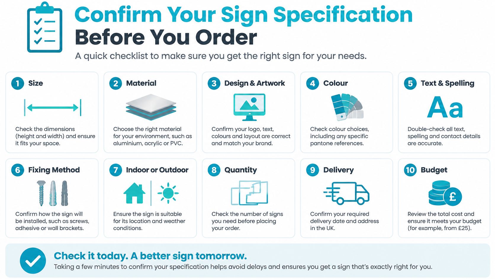
- Style matched to setting. Record the panel's purpose and exact location, including whether it will move between ceremony and reception.
- Lighting test completed. Note which version passed the venue test and retain a photograph of its position for the setup team.
- Lettering checked at real distance. Confirm that names, directions or menu items remain readable without stepping into a queue or circulation route.
- Personalisation proofread. Check names, dates, venue wording and guest lists against a single agreed master document.
- Edges and fixing specified. Include corner treatment, support hardware and the person responsible for installation.
- Physical proof approved. Sign off the actual material and production finish, not just a screen representation.
- Second use arranged. Name the person collecting the sign and record whether it will be kept, reused, hired out or sold.
The visual checklist below is a useful prompt for the wider ordering conversation.
Compare what each quote includes
Check whether you're comparing panels alone or complete displays. A quote that excludes a stand, backing layer or installation hardware isn't directly comparable with one that includes them. Confirm the lettering method too, because applied vinyl, surface printing and engraving create different appearances and affect later changes.
Ask how artwork amendments are handled, what the proof approval covers and which delivery arrangements apply to your order. Agree a delivery date that leaves room to inspect the goods before the venue needs them; don't treat dispatch and arrival as the same event.
At Quote My Wall, all our products are hand made to order in the UK, and we offer free UK shipping on all orders. Those facts answer the manufacturing-location and shipping-charge questions, but you should still confirm the production details and delivery timing for your chosen design.
Make your final decision against the physical proof and written checklist. If something important remains unclear, resolve it before approving production rather than leaving the venue team to improvise.
We offer personalised acrylic wedding signs and stickers, with all our products hand made to order in the UK and free UK shipping on all orders. Visit Quote My Wall to explore your options, then bring your wording, venue position and full-size mock-up requirements to the ordering conversation.